Tuesday, April 25, 2006


Stan Dialogue on Vimeo

This is the same clip as the last post, I'm just trying out a new video provider. Hope it works.

Sunday, April 23, 2006

Click here to watch 'stan-dialogue-05'

Got all the facial animation done today, just the muffin on the table swinging from the mug tree to do. Then final background and colour.

Saturday, April 22, 2006

Click here to watch 'stan-dialogue-04'

Clean-up on the body is done, now I've got the facial animation to do.
Click here to watch 'stan-dialogue-03'

Cleaned up the first little bit... just gotta continue like this today, all seems to be going smoothly. Should get all the clean up done today and hopefully get started on the facial stuff, then i'll be back on schedule after having a week off for my mates 21st and then forgetting to take my work home for easter... Nightmare!
Click here to watch 'stan-dialougue-02'

Still rough, just in-betweened. Also added a camera move which makes it a bit more interesting. Think its ready for clean-up now.

Friday, April 21, 2006

Click here to watch 'stan-dialogue'

This is the first dialogue scene I'm animating, really getting into the tricky parts now. This is a very rough pass (just thumbnails really) to get an idea of how stan will act out the dialogue.
Click here to watch 'final-scene'

This is the final scene of the film(still got a lot of work to do cos I'm not doing them in order) Stil working on it... might change the timing on the picture frame dropping, I've tried a few different things and this is the best so far. I feel like i'm hitting my stride animating now, it's flowing much more easily and this scene is definitley one of the most challenging animation wise.

Monday, April 10, 2006


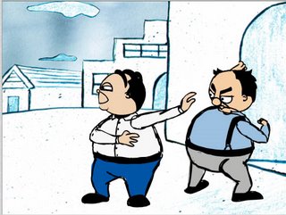
More smear drawings.....This ones quite extreme! they're a lot of fun drawing. I've altered this scene slightly as it was bugging me... I've changed the pose and expression on Stan and given Ollie an extra pose pointing off screen towards Frenchy. It adds a lot without too much extra work. Again just smear drawing between two poses, Chuck Jones used this technique a lot in Warner Bros shorts because of time/budget contraints. I think it gives a great look and feel.
Smear Drawings


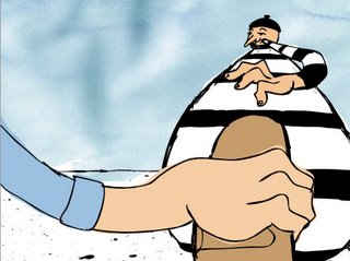
This is the Grab Loaf sequence which I've recently re-done. Before it was a dead on close up of the loaf and hand and it didn't fit the scenes before and after it so I came up with this low shot with extreme perspective. The hand grabbing now has more zap to it too. I've used a couple of smear drawings in this shot so I thought I'd post a few stills so you can see what they're like. When viewed at 12/24 frames a second you dont really notice them but it makes quick action look much more snappy.

Saturday, April 08, 2006

Click here to watch 'Burst-thru-door'

I've skipped a scene here for anyone who's counting..... There should be another scene of the bachelors bouncing up towards the house, I've got a loop of the bachelors bouncing and I've got the background but I wanted to get on with proper animating so I went straight ahead with this last night. I'd had the key poses done for a few days and finally sat down to flesh it out. Now that I'm doing close ups and dialogue I'm trying to get much more expression into the characters. If you look at the sketch book page below you will see a couple that I used in this scene. This probably has the most extreme expression in the whole film, it is building up to the climax and I wanted it to feel quite manic. Basically the two bachelors burst thru the door... look up and see that the mouse has fled....... and previously had eaten up the muffin!


Two pages from my sketch book exploring expressions and ideas for upcoming scenes. Now that I'm getting to the scenes with close ups and acting I am concentrating a lot more on expression. Also I want to incorporate some squash and stretch into my animation because it feels a bit stiff without it.
Click here to watch 'bounce-down'

This is the first post with a final background so this will give you an idea of the FINAL LOOK of the film. Characters still in sillouhette bounce back the way they came.


Final character sheets with colour and final background style. Basically the backgrounds will be drawn in ink then pencil shaded.... manipulated in photoshop to give the pencil shading this blue colour. Then the sky on the exterior shots have this ink stain effect.

Click here to watch 'Fall-off-mount'

Into sillouhette for the fall off the mountain.... I always had this extreme view looking down on the earth in mind, then I saw a sketch from Cognoman in the 28 day challenge at sketchtavern. A similar setup but with a high rise building where he had the building twisting upwards. So I basically stole it! ha ha... sorry Cognoman, I'll give you a credit!

Friday, April 07, 2006

Just found out that the UCLAN university design department has a blog (http://www.disciplesofdesign.blogspot.com/) and they've posted a link to this page so thanks for that guys. I'll have to start updating it now! Anyone visiting from there feel free to leave a comment. In fact anyone visiting at all please leave a comment! (anyone out there?)
Click here to watch 'slo-mo-noooo'

Same fade effect as the throw... this sequence should knit together quite well. they will both be on the same background so it should be a seamless fade from one scene to the other.


Haven't updated this in quite a while so the next couple of days I'll start to put up the backlog of work i've done recently...... following on from the book throw scene I've got another slow mo shot of the two bachelors about to get hit by the book. These two pages of my sketchbook show the planning of that scene, trying different expressions and thumbnailing poses/layouts.